.png)
.svg)
.svg)

Suds Society Detail
Executive Summary
Our Interviewees
We thank each one for their cooperation.


Report
For our project, we constructed a report that contains our data and analysis of Sin-K. We designed the report on Canva and developed the content on Google Docs in less than two weeks.
Report

Suds Society Detail → Brand & UX Experience
Suds Society was a branding and website redesign project focused on transforming an overwhelming digital presence into a polished, conversion-focused experience. I refined the brand identity, established a versatile logo for both digital and print, and restructured the website around clearer services, pricing, and booking pathways, creating a cohesive experience that better reflected the quality of the business.
Role
Website + Visual
Designer
Roadmap
Brand & Digital
Experience Client
Tools
Claude (brainstorming, wireframes)
Squarespace (build)
The Problem
Too much information, not enough direction.
The client's existing website was overwhelming. Content and structure had grown without a clear hierarchy, making it difficult for visitors to understand what the business offered, what made it different, or what action they should take next. The experience felt more like an information dump than a purposeful customer journey.
Beyond the website itself, the business lacked a cohesive brand presence. There was no established visual identity that could carry across digital and physical touchpoints, from the website to business cards and printed marketing materials.
This made it difficult for the business to create a recognizable presence and build consistency as it grew. I saw the opportunity to solve both problems together: create a clearer digital experience while establishing a brand system that could work beyond the screen. I developed a distinct visual direction and refined the logo into a clear, versatile mark that could scale across the website, business cards, print materials, and future brand applications. From there, I translated that identity into the website through typography, layout, imagery, and visual hierarchy.
The result was more than a redesigned website; it was a cohesive brand experience designed to make the business feel recognizable, credible, and easy to engage with, while guiding visitors toward becoming actual customers.
Process
Understanding Before Designing
I started with an audit, not assumptions. Before touching the visual design, I broke down the existing experience to understand exactly where it was creating friction. I reviewed the content, navigation, hierarchy, calls to action, and the path a potential customer would take from landing on the site to actually booking an appointment. I found the problem wasn't a lack of information, but too much information without enough direction. Important details were competing for attention, the navigation didn't clearly guide visitors, and there wasn't a strong visual identity connecting the experience.
I brought those findings directly to the client and used them as the starting point for our conversation. Rather than designing around what I thought the business needed, I wanted to understand what success actually looked like from his perspective.
Experience the Redesign
Three Priorities, One Clear Direction
Aligning around key business goals
Drive more bookings
by making the path to conversion more obvious, with clearer calls to action and fewer steps between discovering a service and scheduling an appointment.
Help prospective customers understand the services
by organizing key information more clearly so they can quickly compare options, understand what to expect, and make informed decisions without searching through multiple pages.
Create a recognizable brand presence
that feels authentic to the business, using a cohesive visual identity across the website and printed materials rather than relying on a generic template.
From there, I prioritized the highest-impact changes based on those goals, the available project timeline, and what could realistically be improved without overcomplicating the experience. Therefore, I rebuilt the site's structure around the way customers actually needed to navigate it, while using the client's existing brand foundation as a starting point and strengthening it into a more cohesive visual system.
Key Decision
Simplify Before You Decorate
One of the biggest decisions I made was to simplify before adding anything new. When a website feels cluttered, the instinct can be to add more sections, more explanations, and more visual elements. But that would have amplified the underlying problem.
Instead, I focused on removing what wasn't helping, restructuring the navigation around the information customers cared about most: services, pricing, and booking, and creating a clearer hierarchy between primary and secondary content. I also wanted the branding to carry more of the communication burden. Rather than relying on extensive copy and competing sections to build credibility, I created a more intentional visual identity that communicates the business's personality and professionalism at a glance.
This approach also extended beyond the website. I established a clearer logo and visual direction that could be consistently applied across business cards, printed materials, and other customer-facing touchpoints, giving the business a recognizable identity both online and offline.
The result was a website that didn't just look cleaner; it had a clearer purpose. Every major element had a reason to exist and a role in moving the customer toward the next step.
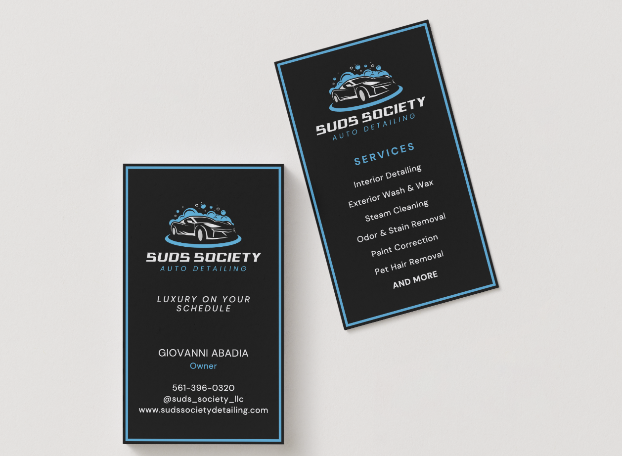
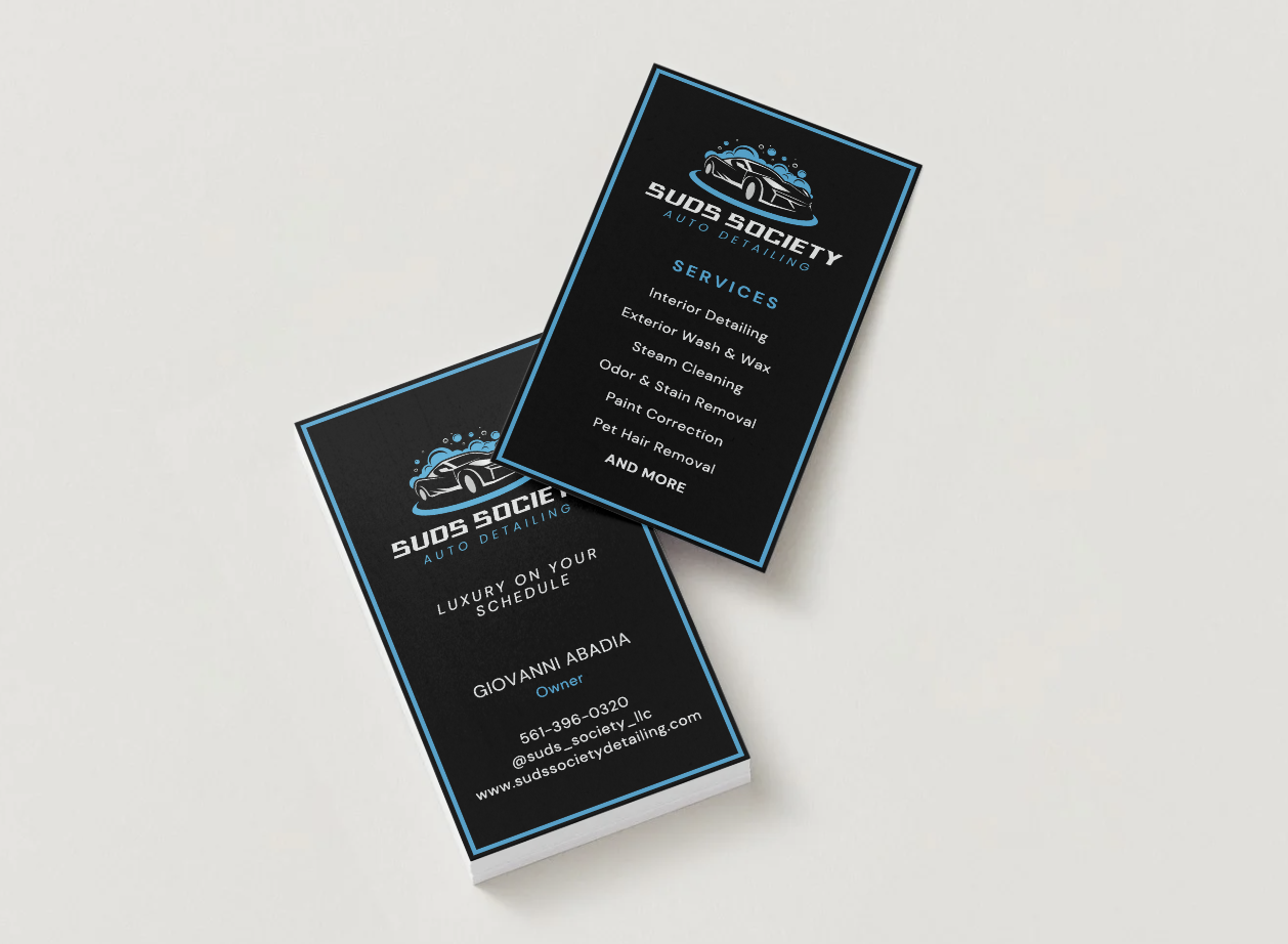
Logo + Business Cards
Outcome
Turning Clarity into Growth
Since launch, the site has seen a 20% increase in traffic, measured through Squarespace Analytics. The client also reported that customers found the new experience easier to navigate and more trustworthy, which contributed to more booking inquiries.
The project also required only one round of revisions, limited to swapping a few images. For me, that was a strong signal that the initial direction successfully aligned with the client's expectations and business goals.
More importantly, the project gave the business something it didn't have before: a cohesive digital and physical brand presence that could grow with it.
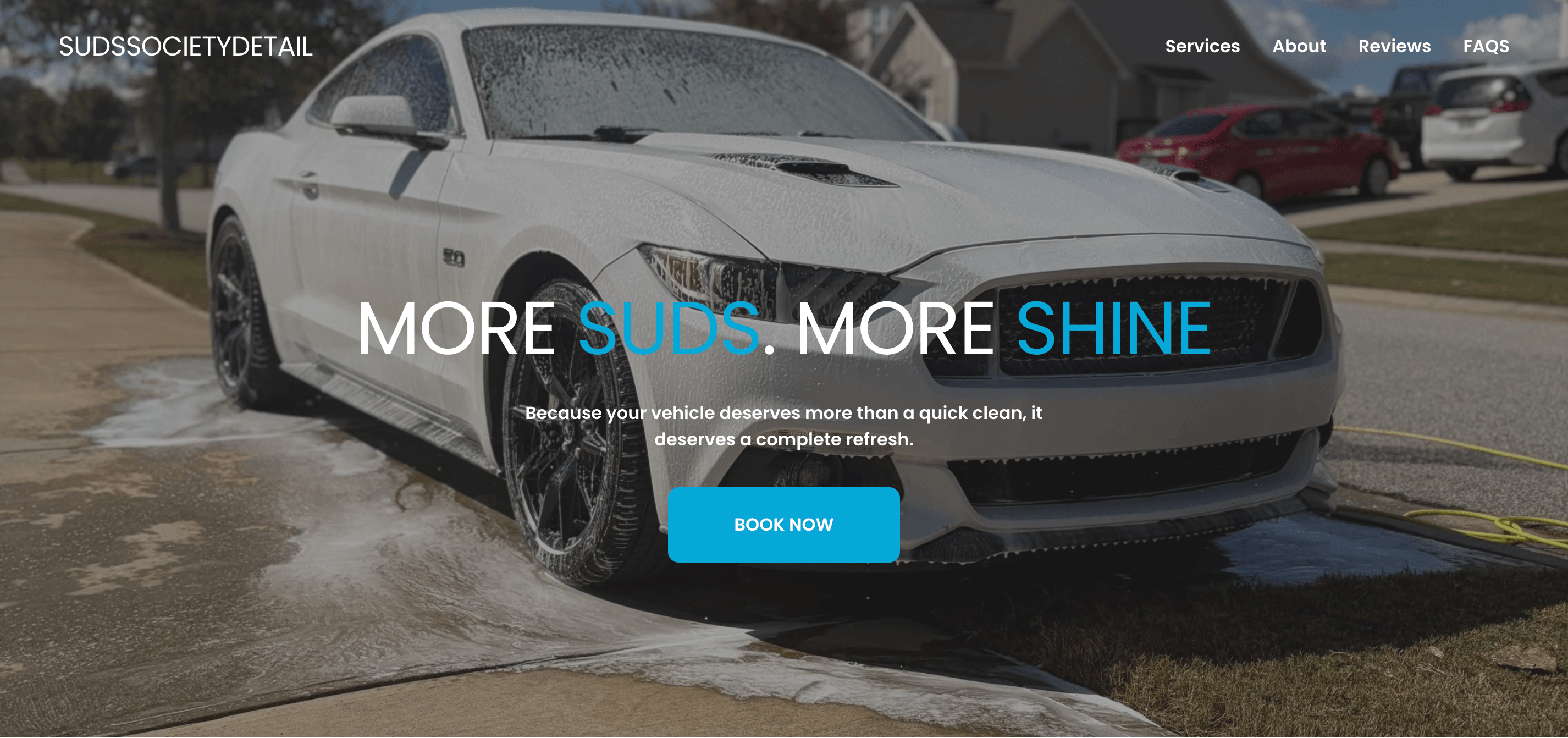
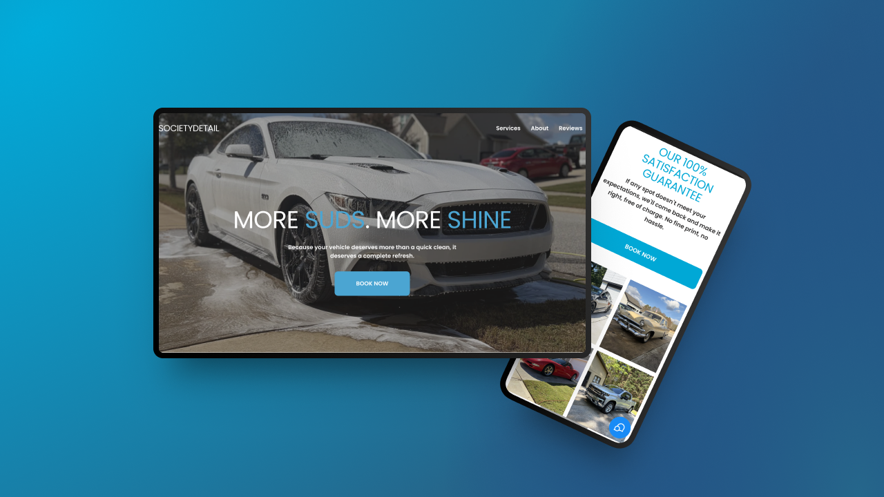
Suds Society Detail Hero Section
Reflection
Designing Beyond the Screen
If I were to take the project further, I would look beyond the website itself and focus on improving the booking experience.
The redesign addressed the front-end challenges by helping customers understand the business, build trust, and take the next step. However, the client's booking process remained largely manual. Integrating the website with a more streamlined booking and operations system could reduce friction for the business while creating a more seamless experience for customers.
This reinforced an important lesson for me: successful UX doesn't end at the interface. It requires understanding the entire experience surrounding a product and identifying where friction exists beyond the screen.
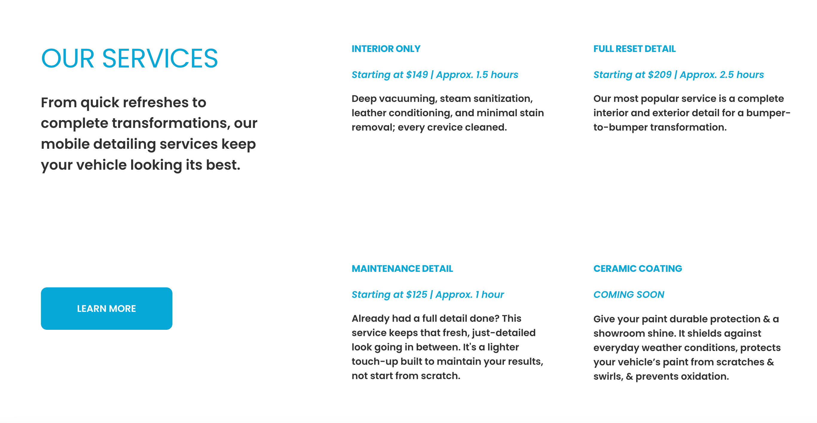
Services
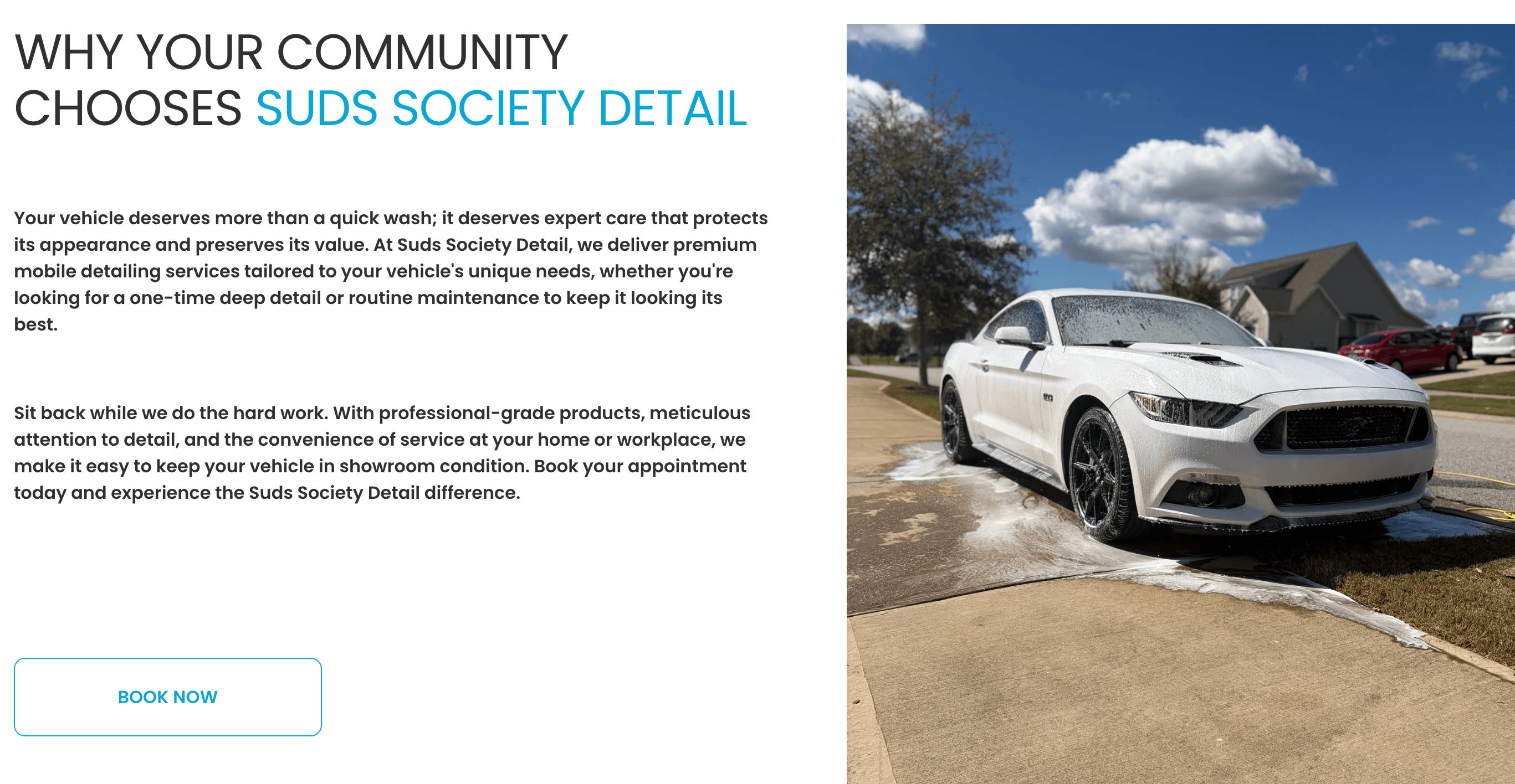
About
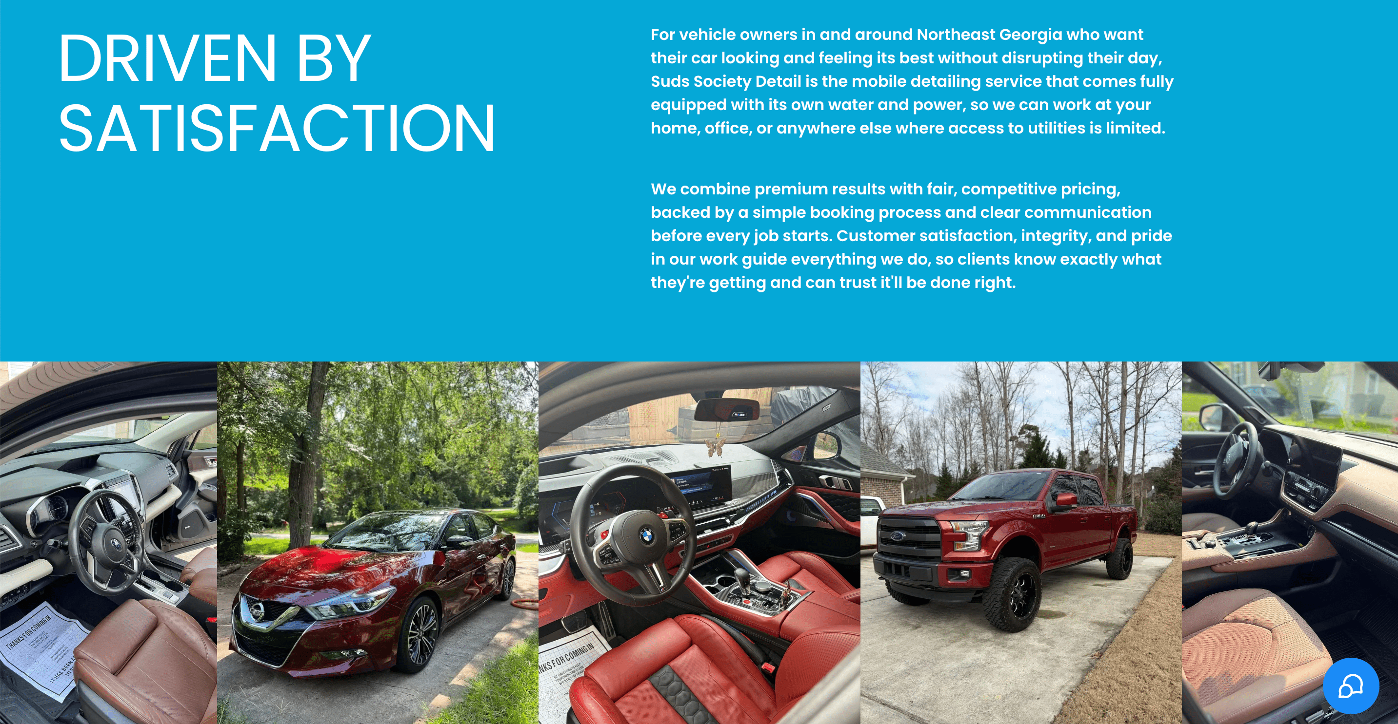
Reviews
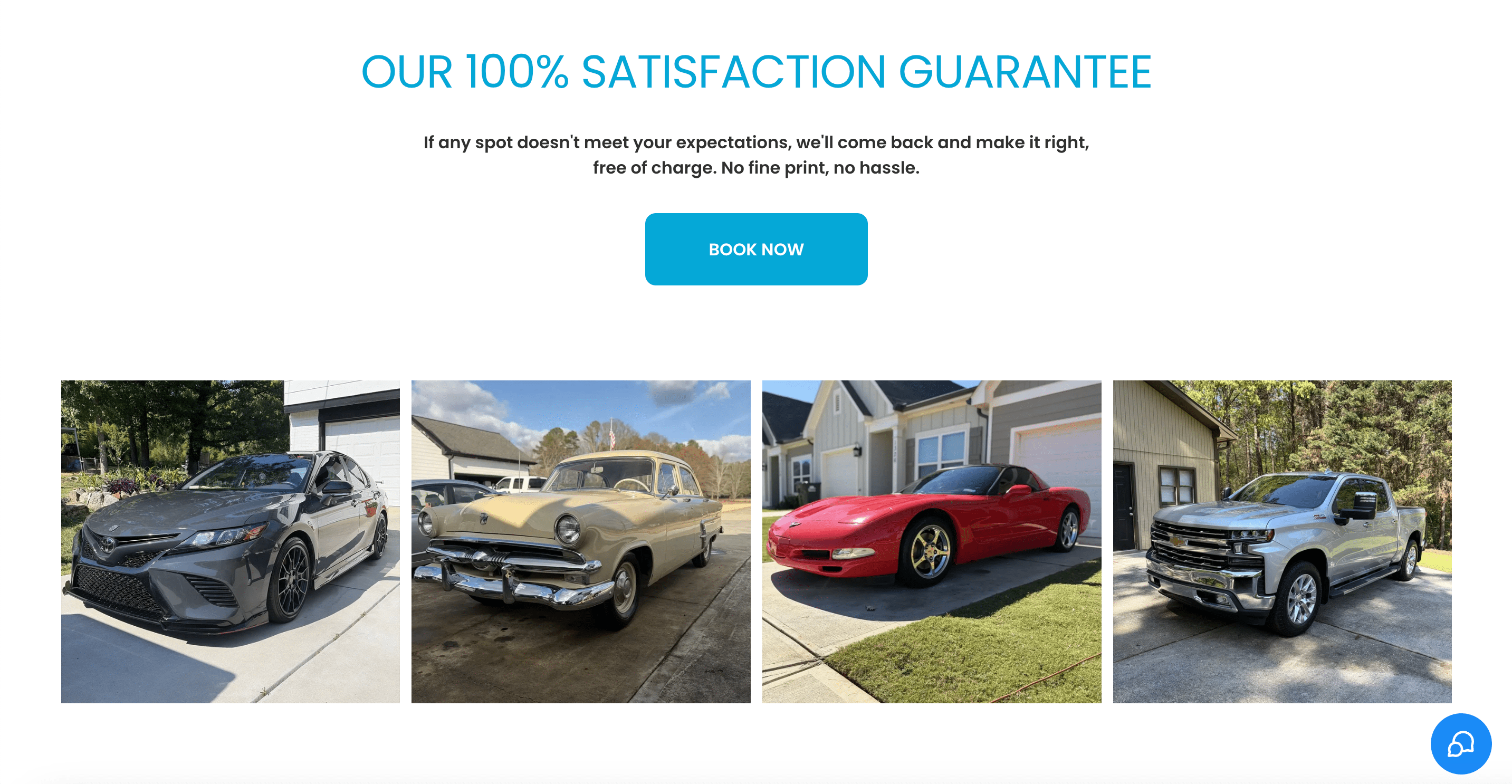
Satisfaction Guarantee
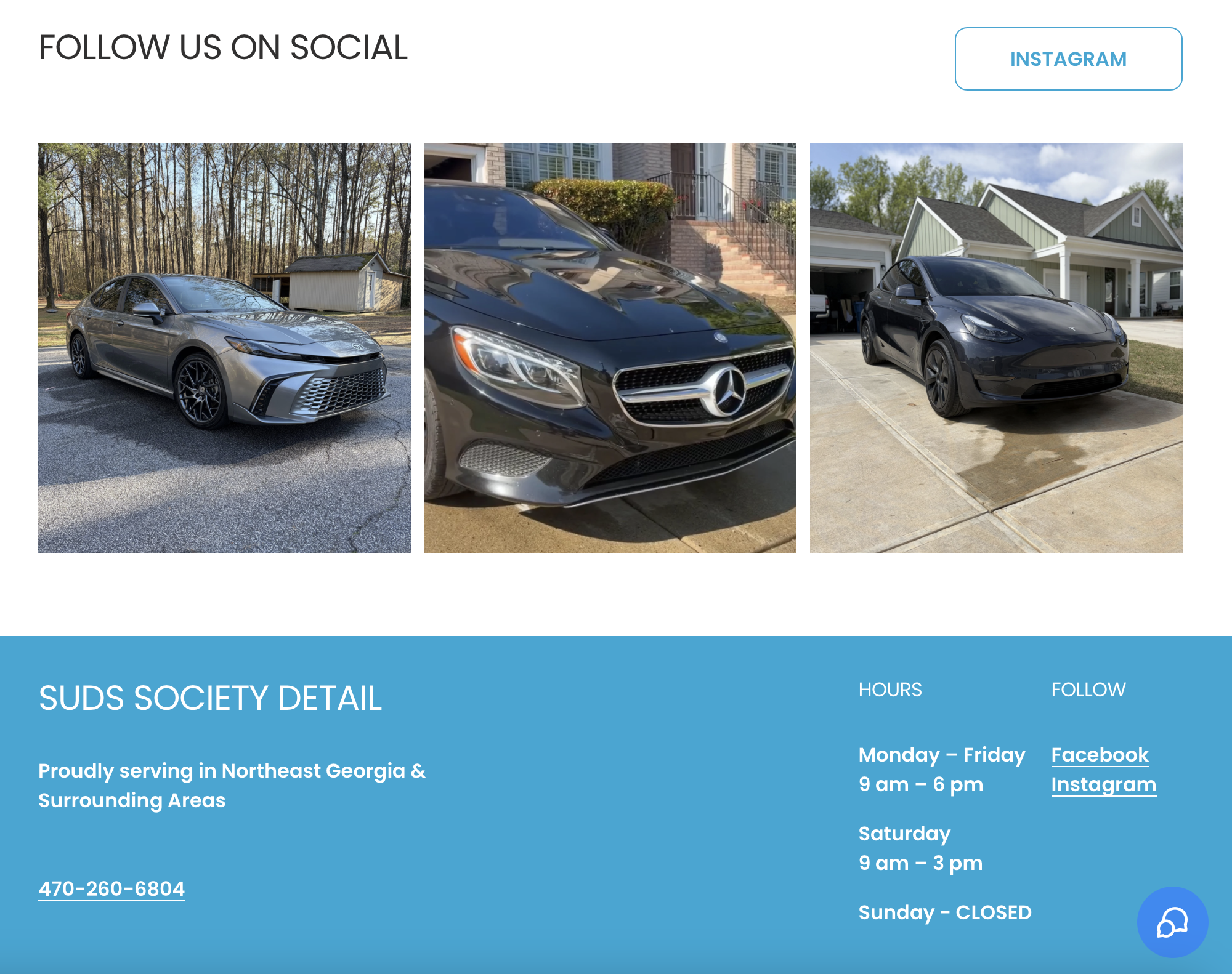
Footer
APEX GYM → Concept Project
Turning Apex’s Identity Into an Experience
Apex had the community. It had the personality. What it didn’t have yet was a digital presence that told that story.
From Zero to Apex
Apex Gym was essentially starting from zero when I came into the project. They had a strong identity within the local fitness community, but their digital presence didn’t reflect the experience people actually had when they walked through the doors.
So the challenge wasn’t simply, “How do we build a website?” It was: How do we give Apex a digital presence that feels as strong, authentic, and distinct as the gym itself?
I wanted the site to do more than list memberships, classes, or hours. It needed to communicate what makes Apex different within Greenville’s fitness scene and give someone visiting for the first time a sense of, “This is where I belong.” Starting with a blank canvas gave me the opportunity to think about the experience from the ground up, from how someone discovers the gym, to what they need to know before joining, to how the visual language could capture the energy and personality of the space.The goal was to turn a blank digital slate into a presence that felt unmistakably like Apex.
Key Decision
Don't outsource the UX reasoning to the AI
AI can produce a polished interface fast, but it defaults to organizing information the way a system finds convenient, not the way a person actually thinks through a task. I deliberately designed around the user's mental model instead, layering in progressive disclosure so people see what they need in the moment rather than everything at once, and specifically designing for edge cases (missing information, mistakes, interrupted tasks) that a first AI pass tends to skip. AI accelerated execution; it didn't make the judgment calls.
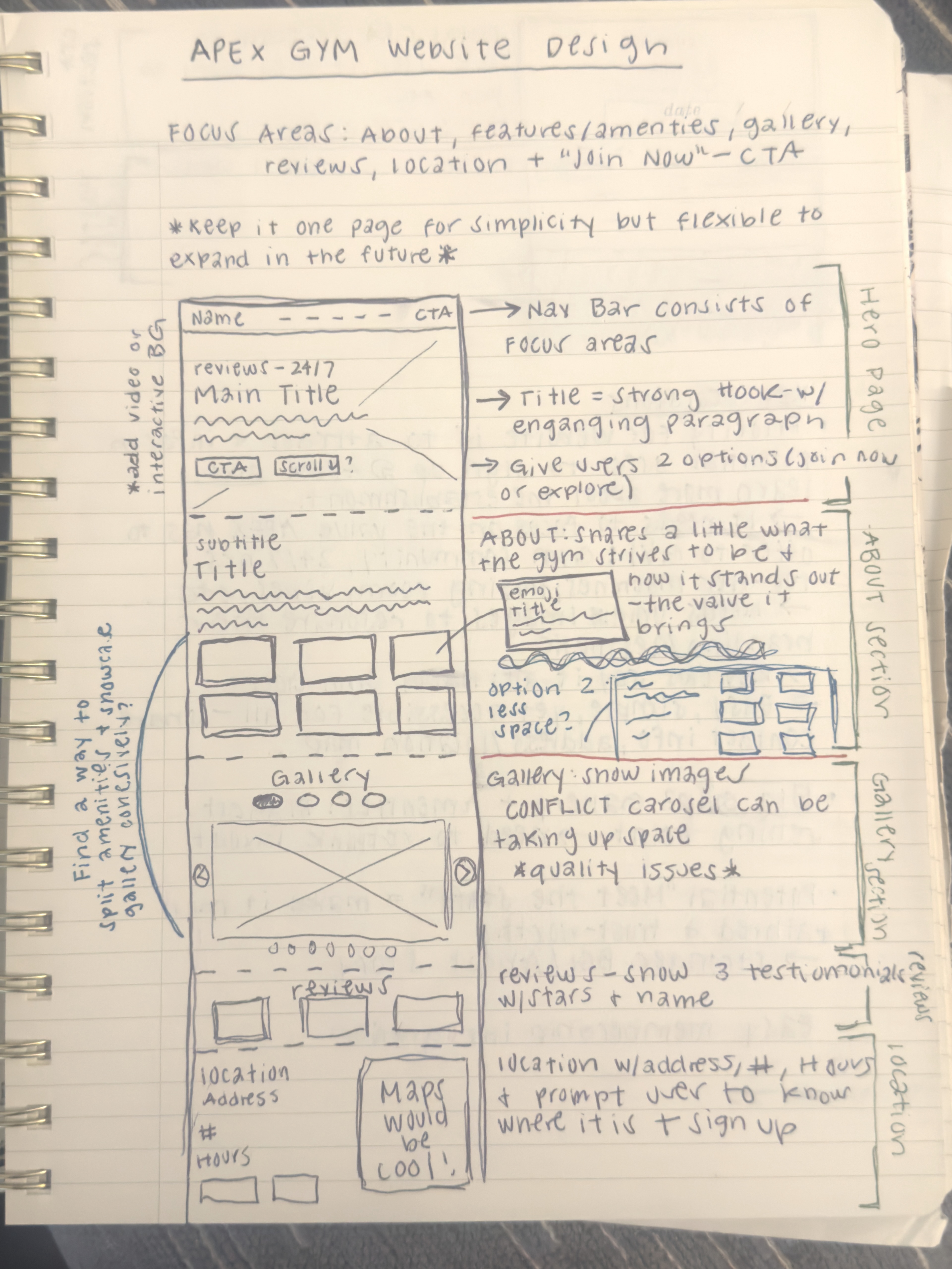
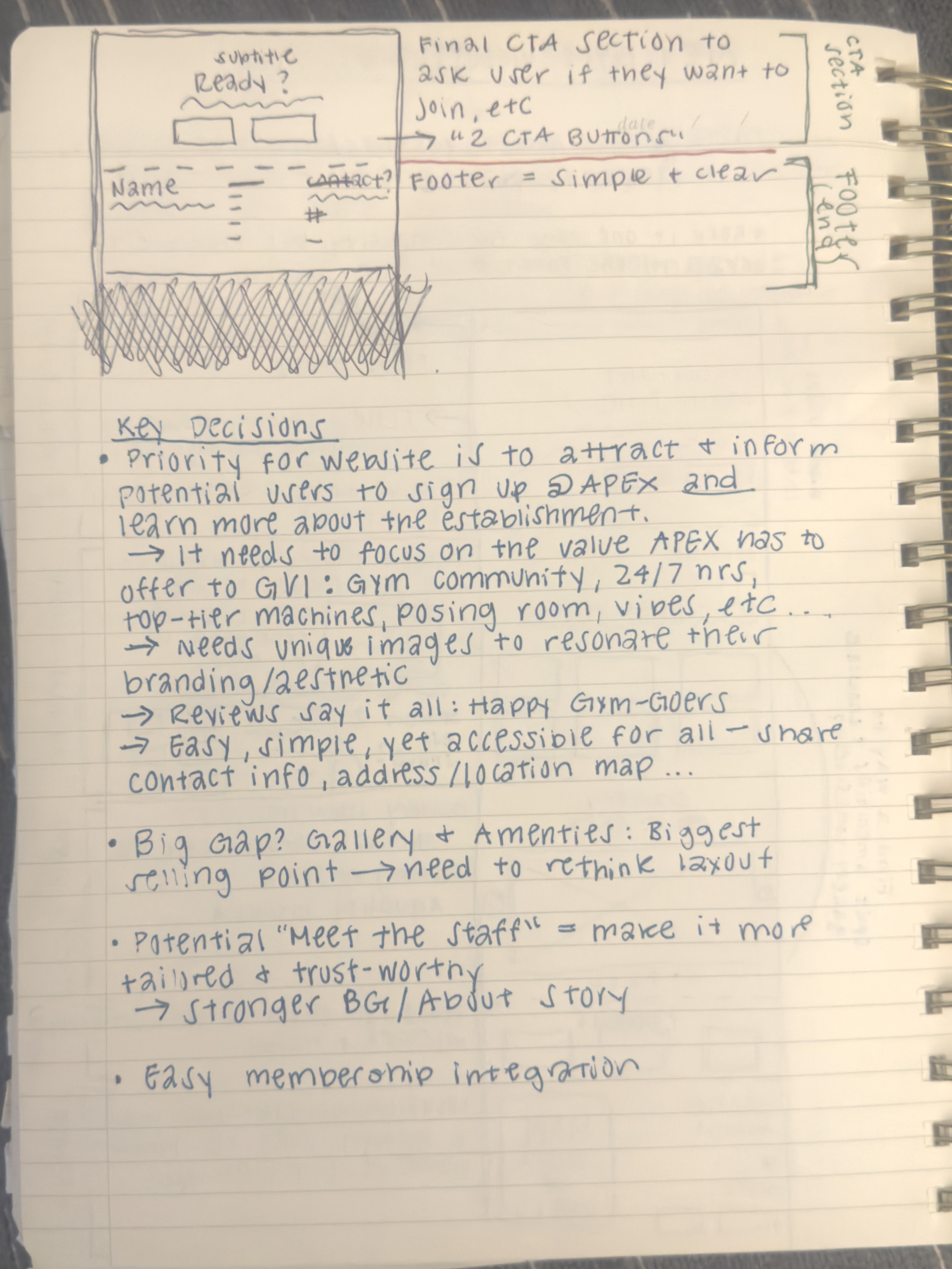
Early sketches and ideation that shaped the website structure and key findings.
The Process
Where AI Needed Real Intervention
The first outputs were generic: copy that could describe any gym, stock-feeling visuals, and styling with no connection to Apex's actual identity. I replaced the copy, pulled real images from the gym's own social presence, and corrected the visual direction until it actually looked and felt like Apex rather than a template with their name on it.
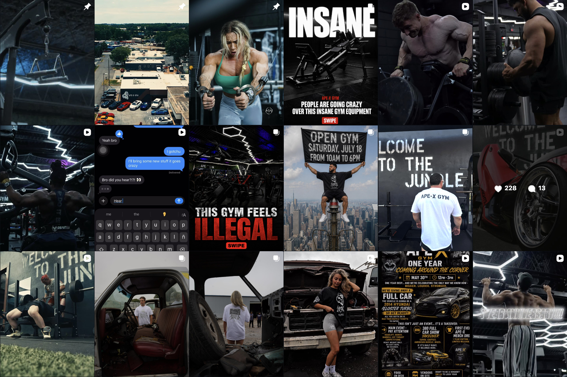
Current instagram page aesthetic
Key Takeaways
The Outcome
I shared the concept with the actual owner, who responded well to the direction. He's currently mid-renovation on the physical gym and has his time and budget focused there for now, but he told me that once that's settled, he wants to take updated photos and move forward on an actual site, because he'd been meaning to get one built. That's a real, if early, signal that the direction solved a problem he genuinely has, not just one I assumed he had.
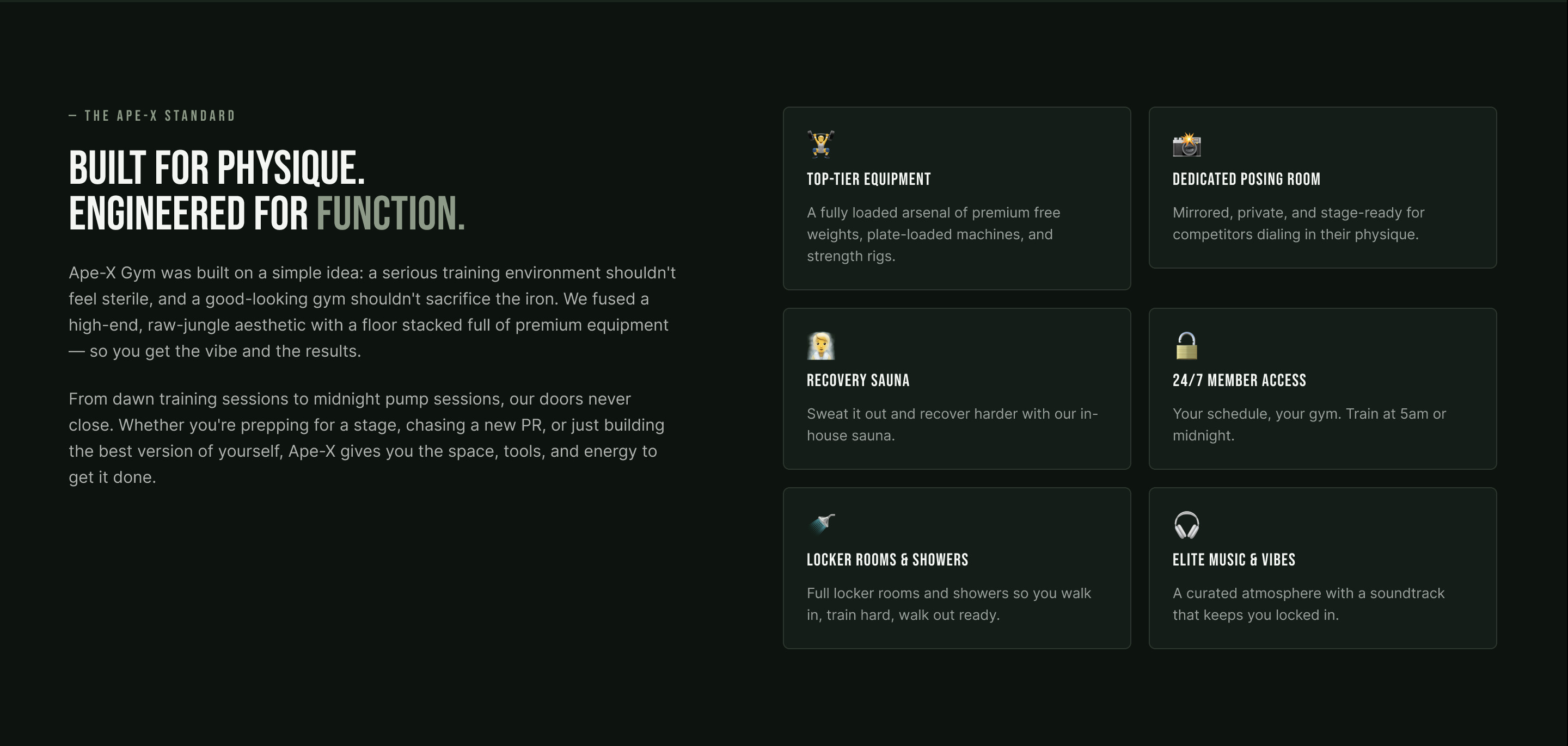
About + Amenties - Prototype
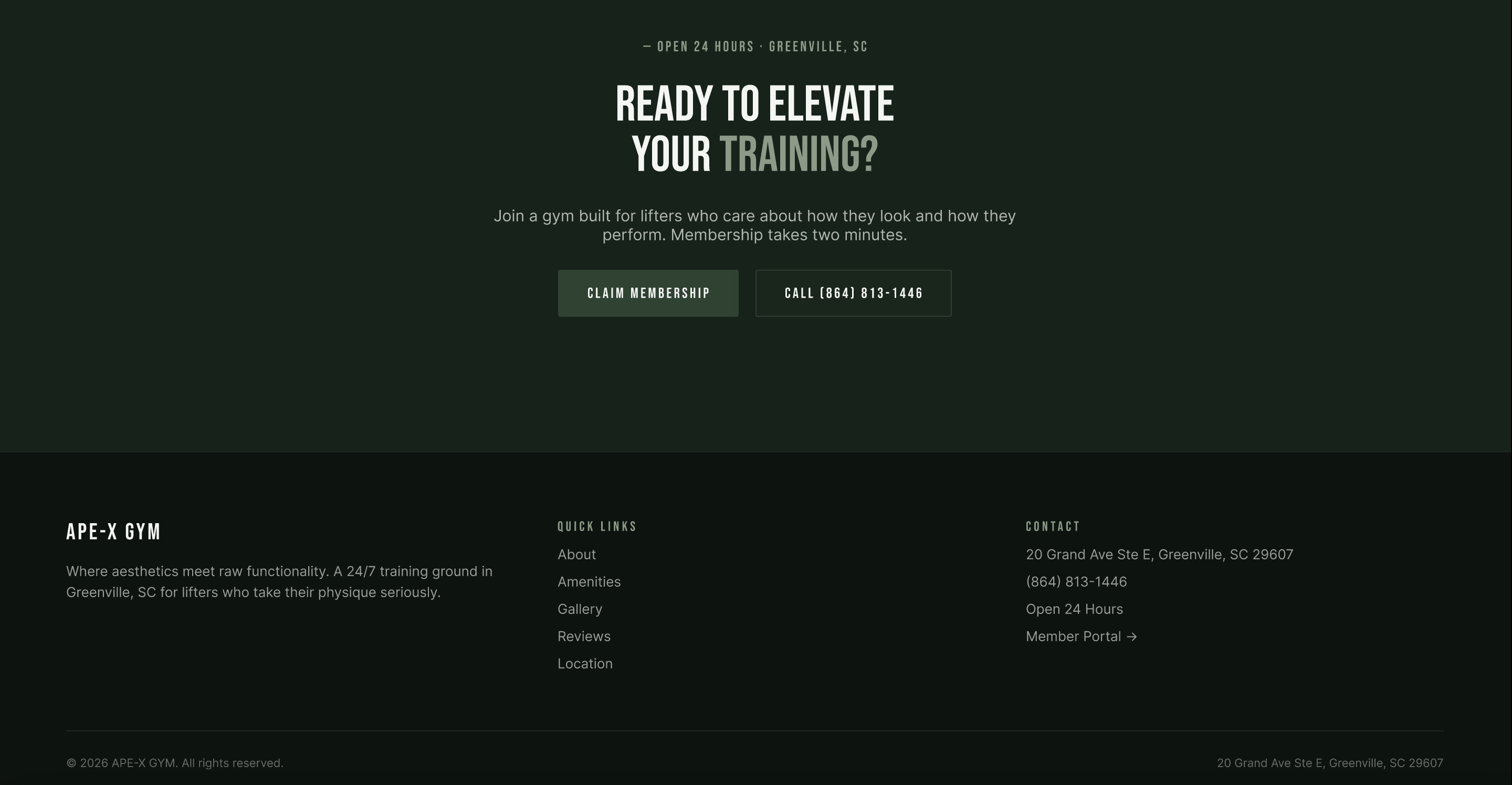
Final CTA + Footer - Prototype

-min.png)
Overview
Good Shit is an educational gut health tracker application that focuses on informing users about their digestion health and bowel movements. The primary goal was to inform, identify, educate, and value the importance of digestion health. Team Janice's focus was to surface challenges such as creating and integrating an informational gut health tracker, designing an educational yet informational platform where users can learn and understand their bowel movements, and incorporating medication and doctor consultations for users to become more knowledgeable about their digestion system.
Moreover, Team Janice recognized the challenges inherent in developing a holistic gut health tracker and educational platform. Creating an informational gut health tracker required thoughtful consideration of data input methods and user-friendly interfaces to ensure seamless tracking of daily habits. The design of the educational platform demanded a delicate balance between providing in-depth information about digestive health and presenting it in an easily understandable and engaging manner. Integrating features for medication tracking and doctor consultations posed technical challenges, such as ensuring data privacy and secure communication channels between users and healthcare professionals. Despite these challenges, Team Janice's commitment to fostering user awareness and knowledge about digestion health has resulted in the creation of Good Shit, a versatile and user-centric application that goes beyond conventional health tracking to address the broader aspects of digestive well-being.
Role
UX Designer
UX Researcher
Timeline
October-December 2022
Approach
Lean UX
Tools
Canva
Discord
Figma/FigJam
Background
What is Lean UX?
Lean UX is a user-centered design approach that integrates principles from user experience (UX) design, Lean startup methodology, and Agile development. It emphasizes a collaborative and iterative process focused on delivering value to users. Therefore, this method allowed us to prioritize outcomes over features. It centered on testing assumptions through minimum viable products (MVPs), gathering early feedback, and continuous iteration. Our class project, conducted for IAD4000 (Interaction Design II) at Kennesaw State University and supervised by Dr. Michael Lahey, followed this process.
Problem Statement
The purpose of Good Shit is to inform others about the importance of gut health. The established domain highlighted that several health-tracking applications fail to educate users and offer a proper structure to record logins of their own digestion health. Our initial problem statement was finalized towards the end of the project once we revalidated our findings. We concluded that:
The health and lifestyle field mainly emphasizes goal-setting for health-conscious individuals. Existing products fall short in explaining why gut health is the way it is. Our solution addresses this gap by allowing users to log bowel movements, identify patterns, and providing unbiased information on gut health. We target those curious about health, not just the health-conscious. Success for us is seeing active user engagement and positive recommendations.
Initial Proto-Personas
In Lean UX, Proto-Personas are hypothetical users embodying our team's assumptions about the potential users of our product and their motivations. These Proto-Personas can evolve within our timeline as the team gains insights from user research.
Following the identification of the business problem, we utilized outcome-to-impact mapping to brainstorm potential business outcomes. This led to the formation of assumptions about successful design features for our product. We applied these assumptions to identify the potential users who would benefit from our product. Team Janice crafted two Proto-personas based solely on these assumptions, understanding that they will change eventually through ongoing research and learning.

Primary Proto-Persona

Secondary Proto-Persona
Sprint Backlog
The Sprint Backlog is a list of design experiments (MVPs) that the team needs to build and test with users, organized based on priority. After forming our Proto-Personas, we defined the benefits and outcomes by understanding users' reasons for using the app. We then identified solutions, analyzed patterns, and shaped the desired outcome for Good Shit. Combining data from previous steps, we built hypotheses to test assumptions and gain a better understanding of essential learnings. These hypotheses were transformed into a product backlog, guiding the structuring of key statements. This process enabled Team Janice to prioritize and create our Minimum Viable Products (MVPs).

Sprint 1 Backlog
Sprint 1
MVP: User Research
Our team divided tasks for the first week of the sprint. Janice focused on creating a database of common causes of symptoms, Jordan designed screens for doctor's prescriptions and treatment info, Jessie handled the doctor consultation screens, and I worked on the products page, where users can explore popular products that can help with digestion or anything related to gut healing. Each of us developed our prototypes, and before the initial interviews, we merged them. After building our assigned features, we formulated interview questions and conducted interviews with three potential users. One team member moderated the session, while others facilitated and took notes.
Stand-Up Meetings (Daily Scrum)
To maintain responsibility and team alignment, we held short planning meetings every two days throughout the project. As Janice was our Scrum Master, she facilitated discussions, recorded team progress since the last meeting, and noted tasks scheduled for completion before the next stand-up. She kept the team updated on each team member’s responsibilities, progress, and certain challenges or issues the project was facing.
Affinity Mapping
After each interview, we utilized FigJam for affinity mapping, which helped us identify patterns observed by the team. Each team member created sticky notes to organize session notes into categories like lifestyle, doctor experience/relation, and health. As a team, we then validated or invalidated our assumptions, guiding us in progressing with our prototype. In Design Week 1, we interviewed users to understand their needs and test assumptions. Team Janice used these interviews to refine our MVPs by asking questions related to personal aspects, gut health, social life, and awareness.
Paula DeCastro's Affinity Mapping
Paula DeCastro's Patterns
User Research Observations
After getting feedback and making changes to our app, we interviewed three more people to gather additional thoughts. We followed the same process as in week one, using affinity mapping. Team Janice identified significant patterns highlighted during the interviews, which helped us identify major setbacks and grasp a stronger understanding. Some users helped clarify confusing features, such as the favorite button, removing the "New Arrivals" section, and separating doctor consultations and past visits.
Retrospective Meeting
After our initial sprint, we held a retrospective meeting to review successes, team challenges, and identify areas for improvement in Sprint Two. This three-week sprint and retrospective deepened our understanding of the Lean UX Canvas and prompted a reassessment of our assumptions. Team Janice used these insights to advance to high-fidelity prototypes, focusing on enhancing the user interface and experience. Previously as a team, we didn't value and acknowledge the importance of a design system. We dove into what they were and the purpose they provide to a product.
Therefore, Design systems are organized sets of reusable design elements, patterns, and guidelines that guarantee consistency and efficiency in creating digital products. They consist of components, patterns, guidelines, and assets like color palettes and typography styles. After grasping this understanding, we managed to prioritize this to ensure visual and functional consistency, and uphold a unified brand identity. This phase marked the finalization of the product's design system, establishing a robust foundation for our design approach and brand identity.

Finalized Design System
Sprint 2
Revalidation
Revalidation played a crucial role in Sprint Two as it revisited the assumptions from the beginning of Sprint One. During this phase, we moved forward with our fresh insights, evaluating successes, failures, and areas for improvement. Team Janice completed the eight-step Lean UX method, selectively revising specific areas. We chose to remove the goal-setting feature and the product page due to low interest and biased comments. Simultaneously, we introduced three new features— a profile page, an effective onboarding process, and an articles section on gut health, aiming to enhance the user experience. Additionally, we updated our product problem statement based on the discovery that users are curious to learn more about the health of their stool.
New Proto-Personas
Concerning our Proto-Personas, Team Janice opted for a complete overhaul due to the mismatch with our observations. Aria and Kelly didn't align with our stated assumptions, leading us to create Alexis and Evan. These new Proto-Personas better emphasize the significance of their interest and awareness in gut health.

Updated Primary Proto-Persona

Updated Secondary Proto-Persona
User Research Observations
We created features from our Sprint Two backlog for interview sessions, following the same method as in Sprint One—interview sessions, stand-up meetings, affinity mapping, and continuous discussions. In this phase, we introduced usability testing with task-based scenarios for each feature, gaining insights into user feedback and design element importance. Post-interviews, we used FigJam to apply observations and conduct affinity mapping, identifying new categories beneficial to our product. Team Janice consistently discussed and designed our prototype, aiming to deliver a polished high-fidelity product.
Refinement
In the final week of Sprint Two, we focused on completing the prototype to achieve a polished high-fidelity application. We finalized the visual design to establish a robust and visually appealing foundation. Conducting three interviews with task-based scenarios provided valuable criticism and detailed feedback on our flow and prototype, incorporated into our final affinity mapping session. As Sprint Two came to a close, Team Janice refined and completed our high-fidelity app. Collaboratively, we identified crucial improvements that highlighted users' needs and goals. Additional features were introduced to enhance the overall user experience, proving successful in subsequent interview sessions and observations.
Final Designs
I contributed to various screens and sections, actively participating in discussions. Team Janice collectively decided to refine and finalize the app's visual design.
In these screens, I emphasized cohesiveness to enhance the overall user experience for app users.

Homepage

My Profile Screen

Logging Screen

My Profile - Insurance Screen


Conclusion
Takeaways
Good Shit was my second experience in Interaction Design but as a team designer. While our leader equipped us with her vision, resources, and guidance, the other team members and I focused on creating the necessary. It was an interesting opportunity to work with others and learn about their workflow, knowledge, and opinions. Our leader prioritized communication and honesty, which were a huge influence on our decision-making. Our team had a great connection with each other, which was a plus because it allowed us to be comfortable with our team members.
Lessons learned
Something that I wish that could’ve been different is having trust. Insufficient trust led to being part of the uncertainty in our decision-making. As we made changes, some of our members were concerned about not being able to meet deadlines in our timeline. This led to members being comfortable with the initial designs and not responding well to innovation from our findings.
As previously stated, not having enough time to further our insights led to unresolved questions and concerns. If we had a stronger trust connection, I think our team would’ve been more open, proactive to change and recognized the importance of sharing their concern, and creating or supporting a game plan. Our leader was very considerate and anticipated our team members' concerns by being accommodating and reasonable with our schedules and overall workflow.
After all, if additional time had been given during this project, we would’ve focused on setting up more user interviews and usability testing to expand on our insights and questions we had. Furthermore, this would’ve helped us to support our design implementation and clearer identification of product problems.
Overall
Creating Good Shit was an exciting and spontaneously fun experience to create a gut tracker application that can actually be extremely valuable and functional for millions of users who are actually interested and would like to learn more about their digestion heath. If this was launched or introduced in the future, I would’ve personally used the application to become more conscious about my gut and be more proactive about my wellness. During this project, I learned the significance of exploring new ideas and design approaches without fear or limitations. It definitely challenged the team but I think it demonstrated to us how each team member responded to change. We accommodated each other and we were pleased with our final outcome! Thankfully, I can apply my knowledge and expertise in the design world!

.png)
Aura
Aura is a retail kiosk that reimagines in-store shopping by combining personalization, self-service, and guided discovery. By integrating order pickup with features like color analysis, it reduces decision fatigue and helps users make faster, more confident purchasing decisions. The experience is designed to balance efficiency with engagement, ultimately improving customer satisfaction and supporting retail conversion.
Timeline
February - April 2023
Role
UX Designer & Researcher
Approach
Goal-Directed Design
Tools
Canva
Figma
FigJam
The Problem
Existing kiosks prioritize transactions over people
Most retail kiosks are built for contactless speed, not for connection. They handle transactions efficiently but miss the moment entirely: the shopper who wants guidance, personalization, and a reason to feel confident in their purchase. Aura was designed to fill that gap, an interactive kiosk that integrates with retail stores to deliver seasonal color analysis, streamlined online order pickup, and item reservation, all within one cohesive, personalized experience.
Research
What we learned before touching a screen
Using Goal-Directed Design, we grounded every decision in qualitative data. The research phase moved through a literature review, a competitive audit, and five in-depth user interviews, each layering our understanding of how people actually shop and what consistently frustrates them.
Literature
Retail kiosk adoption increased post-pandemic as shoppers adjusted to reduced employee interaction
Competitive Audit
No direct competitor offered color analysis + order pickup in one kiosk, a clear white space in the market
User Interviews
Shoppers in their mid-twenties wanted speed, but craved personalization, especially around color and style fit


Two of five interviews were clustered into behavioral themes that shaped every downstream requirement.
The patterns were consistent: users felt overwhelmed by options and under-guided by existing tools. The insight that shaped Aura most is that people don't just want to buy faster; they want to feel more confident doing it.
Modeling
Designing for two distinct users
Based on our research, we built two personas that informed every subsequent decision.
Gabriela — Primary persona
A frequent shopper who values comfort and efficiency. She wants the kiosk to remember her preferences, surface relevant recommendations, and get her in and out without friction, while still feeling like the experience was made for her.
Steven — Secondary persona
A less frequent shopper who needs more guidance. He's open to the color analysis feature but needs it to feel intuitive and non-intimidating, not clinical or overly complex.


Research-backed personas that kept design decisions anchored to real user behavior, not assumptions.
One major insight from the modeling phase: users needed greater control. The complexity of color analysis and pickup flows created anxiety, not confidence. That became the design mandate: reduce friction without reducing depth.
Key Design Decisions
Where the real thinking happened
Camera scan vs. guided quiz — why we built both
The seasonal color analysis could run via camera or a short guided input flow. In a public retail setting, not everyone is comfortable being scanned. Rather than defaulting to automation, we designed a hybrid where users choose their path. This preserved speed for confident users and gave control to those who needed it, without compromising either experience.
Dual pickup pathways
We designed two distinct order pickup flows: direct checkout and try-before-you-buy via dressing room reservation. The second flow was a deliberate bet on reducing purchase hesitation, giving users a low-stakes way to confirm their order fit before committing. This supported both user confidence and potential conversion lift for retail partners.
Information architecture before wireframes
We mapped the full navigation system and user flows before any screens were drawn. This kept the team aligned on structure and ensured the two distinct user journeys, color analysis, and order pickup, never created confusion or overlap in the interface.
Design system as a foundation, not an afterthought
After earlier projects in which skipping a design system led to downstream inconsistencies, I advocated establishing one early. The Aura design system, such as color, typography, and components, anchored our high-fidelity work and kept the visual language coherent across every screen and state.
Process
How we moved through GDD
Research
Literature review, competitive audit, 5 user interviews
Established domain context, identified white space in the kiosk market, and collected behavioral data that shaped our personas and requirements.
Modeling
Personas + context scenarios
Translated interview patterns into Gabriela and Steven, then built context scenarios that grounded requirements in real user behavior rather than assumptions.
Frameworks
IA, wireframes, user flows
Mapped the full navigation system before wireframing, a deliberate choice to prevent structural drift during high-fidelity work. Wireframes served as true blueprints, not decorative sketches.

Low-fidelity blueprints that defined element placement, user flow, and overall structure before any visual decisions were made.
Design System
Color, typography, components
Established before high-fidelity screens to ensure visual consistency across every state and screen, and to give the product a cohesive brand identity from the start.

A structured set of reusable components, color tokens, and typography that kept every screen visually and functionally consistent.
Refinement
High-fidelity prototype in Figma
Transitioned from low-fidelity to a fully functional prototype. Focused on simplifying cognitive load, improving screen structure, and ensuring the overall flow felt intuitive for both returning and first-time kiosk users.
Reflection
What I'd do differently
The frameworks phase was where we lost the most time. Underestimating wireframing, treating it as a box to check rather than a structural foundation, filtered into the high-fidelity work, creating rework that ate into our refinement time. If I could do it again, I'd invest more heavily in wireframe fidelity and run at least one more round of usability testing before moving into final screens. The insights we got late in the project could have shaped earlier decisions and produced a tighter, more validated outcome.

Dashboard Menu

Logout

Orders

View Order
Key Takeaway
Personalization and simplicity aren't opposites, but making them coexist requires structure. The most important design decisions on Aura weren't visual. They were architectural: how we organized information, sequenced choices, and gave users control without overwhelming them.
.png)
-min.png)
MedPass
MedPass is a digital intake solution designed to remove friction from one of healthcare's most overlooked pain points, the moment before care begins. Built during a Google Hackathon, the product reimagines how patients check in and how providers receive critical information, making the process faster, clearer, and less stressful for everyone involved.
Timeline
48-Hour Sprint
My Role
UX Lead, Brand & Presentation
Platform
AppSheet (no-code)
Overview
The Problem
Organizations struggle to ensure employees meet mandatory vaccination and health requirements for international travel. The result: project delays, team disruptions, and compliance gaps, not from lack of care, but from a lack of clear, centralized tooling. For busy employees, navigating country-specific medical requirements while managing their workload is overwhelming. The process is fragmented, time-consuming, and stressful, with real consequences if action items aren't completed on time.
Solution
What we built
MedPass is a digital passport for corporate international travel, automating and organizing medical documentation through dynamic email notifications and real-time status updates. The app reduces administrative burden, keeps employees informed on exactly what's required, and gives organizations visibility into team health compliance before travel. Our target audience was large corporations and their employees: busy professionals who needed clarity on medical requirements without it disrupting their workload or their team's momentum.
My contribution
UX Strategy & Design
I led UX alongside my teammate Elizabeth, while Jordy and Ali owned AppSheet development. Working in pairs allowed us to move fast without losing clarity; each team always knew what the other needed. My focus was on translating user goals and pain points into a grounded design strategy, starting with information architecture and navigation, then moving into light wireframes and user flows to guide the build. In addition to UX, I was responsible for shaping the product’s visual identity, including branding, logo creation, and designing the final presentation deck to clearly communicate our solution and its impact.
Early sketches and user flow mapping that shaped the navigation system and kept design and development aligned throughout the sprint.
Key Design Decisions
Designing for context, not ideal conditions
Corporate travelers are busy, stressed, and not thinking about health compliance, they're thinking about their meetings. Every design decision was made with that reality in mind: clear language, minimal steps per screen, and a flow that respects the user's time and cognitive load.
Information architecture first
Before any screens, we mapped the navigation system and user flows to ensure the app served two distinct users: the employee completing requirements and the organization tracking compliance, and getting this right early kept development and design in sync throughout the sprint.
Automation as the UX
Rather than relying on users to check in manually, we built dynamic email automation and status updates as core UX features, reducing the mental overhead of tracking requirements by surfacing the right information at the right time.
Beyond Design
Brand & presentation
With the prototype taking shape, Elizabeth and I shifted to packaging the work. I designed the MedPass logo to establish brand recognition and build initial trust with the judging panel, a simple but intentional mark that made the product feel real, not just functional. We created the full presentation deck, coordinated our 4-minute pitch, and ran through multiple practice rounds to tighten our delivery. We both knew that how we communicated the idea was just as important as what we built.
Outcome
Place at Google Hackathon out of all competing teams
Prize awarded to Team Black Cats
From blank slate to winning pitch
Cross-functional teammates across design and no-code development
Contribution split
Design & Brand
Development & Execution
Jenny Trejo → UX Lead, Brand & Presentation
Elizabeth → UX Strategy & Presentation
Jordy → AppSheet Development
Ali → AppSheet Iteration & Execution
Final Product Experience
Final Mockups
Our simple prototype effectively clarifies our end goal and provides a clearer perception. It highlights the keyframes that serve as an outline.
To improve the user experience and practicality of our application, we implemented coherence throughout our prototype.
.png)
Splash

Health Centers
.png)
Assignments Form
.png)
Employee List
Key Takeaways
Results
Winning first place was such an amazing feeling we felt as a team. We were very proud of each other and how Team Black Cats managed to remain positive and trust the process. Because of our hard work and dedication, Black Cats was awarded first place and received the $5k prize. We were ecstatic with the outcome, and we celebrated our success by having dinner together to celebrate, reflect on our work, and express our gratitude towards each other.
Learnings
Because this was my first hackathon, I was nervous but excited about the experience. I learned so much and was satisfied with the outcome and the people I met. Some major takeaways were:
Communicate and comprehend effectively
Working with two individuals who had never worked with UX previously on a cross-functional team forced Elizabeth and me to justify our choices and involve them thoroughly in our user-thinking process. Therefore, communication was key to our team because we had to ensure our each team member needed to understand our approach towards the project.
Ask questions, get answers
It was important to ask questions when we had problems or concerns to move forward with our decision-making. Given our short timeframe, we used our resources and asked our mentors to decide on our design and development decisions.
Balance out the strengths and weaknesses
Acknowledging our team's strengths and weaknesses allowed us to work in pairs and tackle the project with what we knew best and the positive impact it would bring. Through this decision, we were comfortable with our responsibilities and trust each other with the process despite the challenges we still faced.
Organize and structure
We had a short timeline to create and submit our deliverables as a team. We took our time to construct a plan and to execute productively to receive the best outcome.


Give Readers a Voice
.png)
NewsCorp
The New York Post had an opportunity hiding in plain sight: its comment section already gave readers a way to participate, but it wasn't giving them much reason to come back. I was brought in to investigate where that engagement loop was breaking down, identify opportunities to strengthen it, and validate a solution with real users. Rather than jumping straight into a new feature, I started by asking a more fundamental question: What would make someone want to return after they leave a comment or even after they simply read one?
Timeline
2.5 months
My Role
Product Manager & Designer @Externship; NewsCorp
Platform
Perplexity (research), Claude (IA + wireframe reasoning), ChatGPT (copy), Figma AI (rapid prototyping)
Overview
The Problem
The objective was to support NYP's Monthly Active User growth by strengthening retention and engagement, not simply increasing acquisition. My role was to diagnose the existing commenting experience, identify the biggest opportunities, develop and prototype a solution, test it with users, and present the findings directly to NYP's Product Design team.
Too many readers. Not enough reasons to return. Most users engaged passively. They would scroll, read an article, browse the comments, and leave, without a meaningful reason to participate or come back. The comment section had clear potential to become a stronger engagement loop. Still, there was no structured way to reward participation, surface valuable conversations, or give passive readers an easy entry point.
The result was a missed opportunity: engagement remained low, return behavior was inconsistent, and an existing product surface wasn't reaching its full potential.
The Strategic Shift
Fix the foundation before adding a feature
The obvious solution would have been to introduce something new. I deliberately chose not to. Instead, I focused first on strengthening the existing comment loop. My reasoning was simple: adding a new feature on top of a weak engagement foundation could create more surface area without actually solving the underlying problem.
This became one of the most important decisions in the project, and ultimately one of the areas NYP's Product Design team responded to most positively. They specifically noted that outside contributors often reach for a flashy new feature, whereas strengthening the existing product foundation required more strategic thinking.
The Solution
Three ways to turn participation into a habit.
The solution focused on creating more visible signals of participation and giving users multiple ways to enter the conversation.
01 — Upvote / Downvote Visibility
Made reactions to comments more visible, giving contributors a persistent signal that their contribution was being seen and evaluated, and a reason to return and check what happened.
02 — Activity Tab
Created a centralized place for notifications and engagement activity, eliminating the need for users to search throughout the experience for signs that someone had interacted with them.
Design system as a foundation, not an afterthought
After earlier projects in which skipping a design system led to downstream inconsistencies, I advocated establishing one early. The Aura design system, such as color, typography, and components, anchored our high-fidelity work and kept the visual language coherent across every screen and state.
Together, these pieces created a more intentional engagement loop:
Discover → Participate → Receive feedback → Return
The Process
AI accelerated the work. Judgment shaped the experience.
I used AI throughout the process, but intentionally treated it as a collaborator rather than the decision-maker. I used Perplexity to ground the initial diagnosis in existing research around comment-section engagement patterns, Claude to explore information architecture and wireframe structures, ChatGPT to draft and iterate on in-product copy, and Figma AI to move quickly from concepts into a testable prototype.
The important part wasn't simply using these tools, but it was knowing when their output needed to be challenged. AI was particularly useful for generating possibilities quickly, but I made the final decisions based on the product context, the user's behavior, and the specific engagement problem I was trying to solve.
Usability Testing
Five users. One clear signal.
I tested the proposed experience with 5 participants against the live flows to understand whether the new engagement mechanisms were intuitive and compelling. The feature was understood immediately, with no onboarding required.
The strongest signal came from Top Comment. Every participant said they would tap into it, including participants who identified themselves as lurkers. This suggested that users didn't necessarily need another reason to comment; they needed a more approachable way to enter the conversation.
The notification red dot also created a clear return trigger. However, I flagged an important risk: the signal only remains effective if notifications stay intentional and meaningful. If users begin receiving too many low-value notifications, the trigger could quickly become noise. That became an important distinction between creating engagement and creating sustainable engagement.
Cross-Functional Feedback
The strategy mattered as much as the screens.
When I presented the work to NYP's Product Design team, the strongest reaction wasn't focused on the individual UI decisions. It was the strategic framing behind them. The team specifically called out the decision to strengthen an existing feature before introducing additional surface area. That reinforced my belief that the most valuable design decision isn't always the most visually exciting one.
The conversation also surfaced a broader product opportunity: NYP had multiple potential engagement gaps, but didn't yet have a clear prioritization framework for deciding which ones would create the greatest impact. Rather than treating that as something to hide, I saw it as another useful product finding.
The Outcome
Turning research into a roadmap decision
The project's findings informed NYP's product roadmap, with the comment-foundation improvements being incorporated into their planning.
More importantly, the project demonstrated that improving retention didn't necessarily require creating an entirely new experience. There was meaningful opportunity within an existing product surface by making participation more visible, discoverable, and rewarding.
Reflection
The next question: does the behavior actually stick?
If I had more time or access to NYP's analytics, my next step would be to move beyond usability validation and measure whether these changes actually influenced repeat engagement and MAU over time.
I'd also expand the participant pool and segment users more intentionally between active commenters, occasional participants, and true lurkers. The qualitative findings showed strong initial intent, but a larger quantitative study would help determine which engagement mechanisms actually create sustained behavior.
The biggest takeaway for me was that engagement isn't created by adding more things for users to do. Sometimes it's about giving existing behaviors a stronger reason to continue.
.png)
.png)
Ready to connect?
.png)
Thanks for stopping by! If you would like to chat and learn more, please feel free to email me.

©2024 Jenny Trejo | All Rights Reserved